


Never judge a book by its cover is advice that has guided readers for generations, until now. Publishers may finally be ready to prove it wrong.
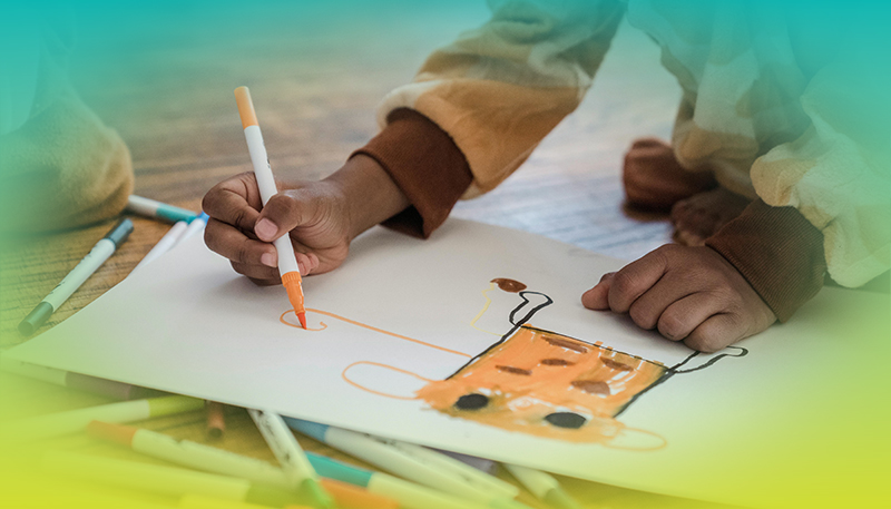
Crayon marks, doodles, stickers and handwritten scrawl are showing up on serious literary fiction, a design movement borrowed from fashion runways where major brands have embraced what designers call "naive art." The rougher and more unpolished the look, the more deliberate the choice.
The trend is, in part, a reaction against its predecessors. For years, publishing defaulted to the so-called "book blob," earthy tones and formless shapes so universal the look became invisible. Naive art is the counter punch, a deliberate rejection of safe and forgettable in favor of designs worth a second look.
The strategy is layered. For younger readers, the look feels familiar and collectible. For authors and publishers, it serves as an intentional misdirect, pairing playful packaging with narratives that deal with emotional turmoil and the complexity of adult life. In a crowded marketplace, standing out matters.
What the trend reveals may be as interesting as the covers themselves. The childlike imagery taps into a collective nostalgia that resonates well beyond the bookshelf and the latest sales charts. In uncertain times, there is something deeply appealing about the simplicity of crayons and a blank page.
Never judge a book by its cover is advice that has guided readers for generations, until now. Publishers may finally be ready to prove it wrong.
Crayon marks, doodles, stickers and handwritten scrawl are showing up on serious literary fiction, a design movement borrowed from fashion runways where major brands have embraced what designers call "naive art." The rougher and more unpolished the look, the more deliberate the choice.
The trend is, in part, a reaction against its predecessors. For years, publishing defaulted to the so-called "book blob," earthy tones and formless shapes so universal the look became invisible. Naive art is the counter punch, a deliberate rejection of safe and forgettable in favor of designs worth a second look.
The strategy is layered. For younger readers, the look feels familiar and collectible. For authors and publishers, it serves as an intentional misdirect, pairing playful packaging with narratives that deal with emotional turmoil and the complexity of adult life. In a crowded marketplace, standing out matters.
What the trend reveals may be as interesting as the covers themselves. The childlike imagery taps into a collective nostalgia that resonates well beyond the bookshelf and the latest sales charts. In uncertain times, there is something deeply appealing about the simplicity of crayons and a blank page.